Modo

Process
- Research
- App audit
- Design
- Document
- Test & implement
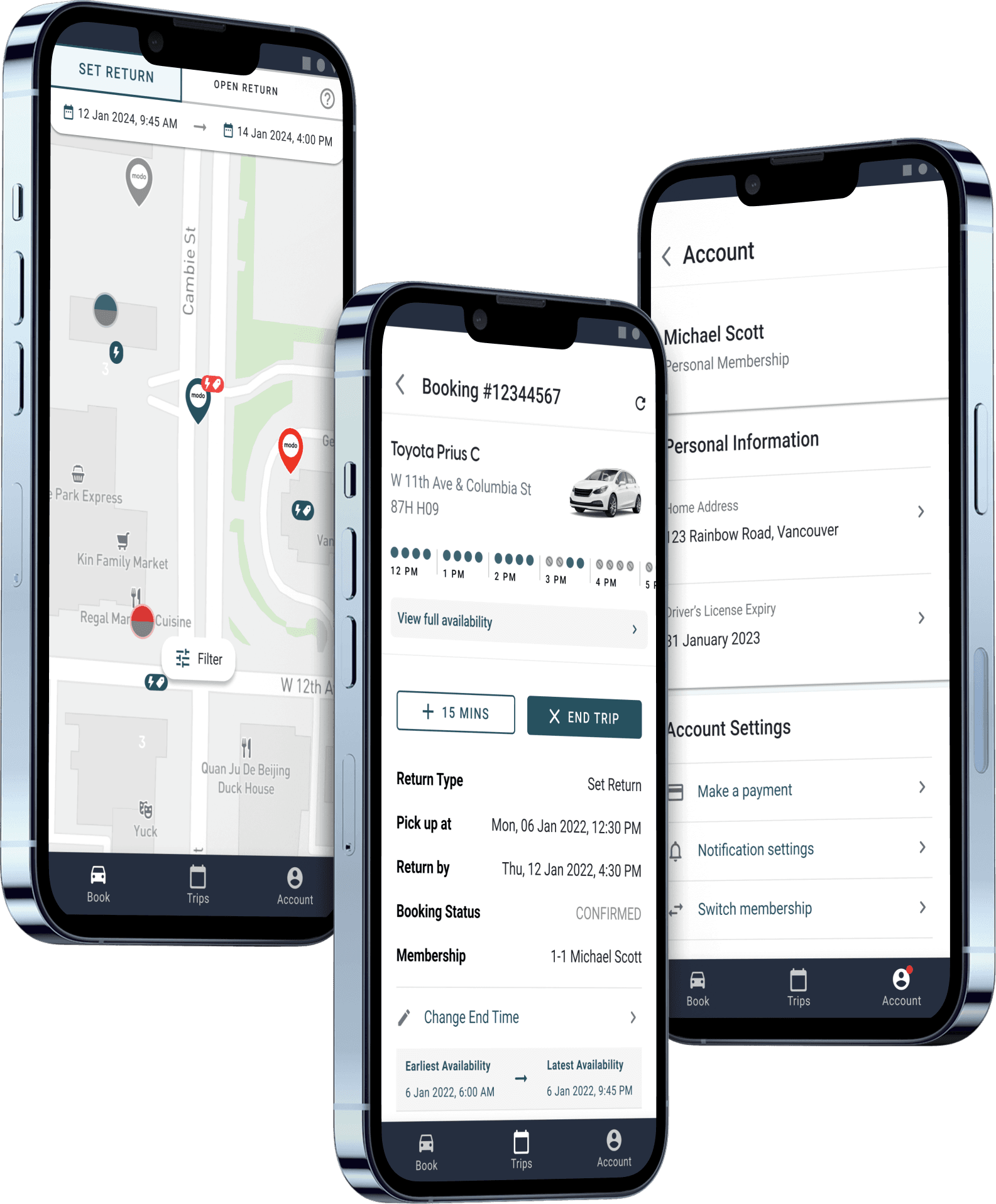
During my internship at Modo, a Vancouver-based carsharing service, I contributed to the development and documentation of scalable mobile UI components focused on consistency, accessibility, and collaboration between designers and developers. The project involved creating reusable patterns and improving component organization to support a more unified product experience across the mobile app.
Problem
The mobile product lacked a unified component library, making it difficult to maintain consistency and efficiently scale new features.
Decision
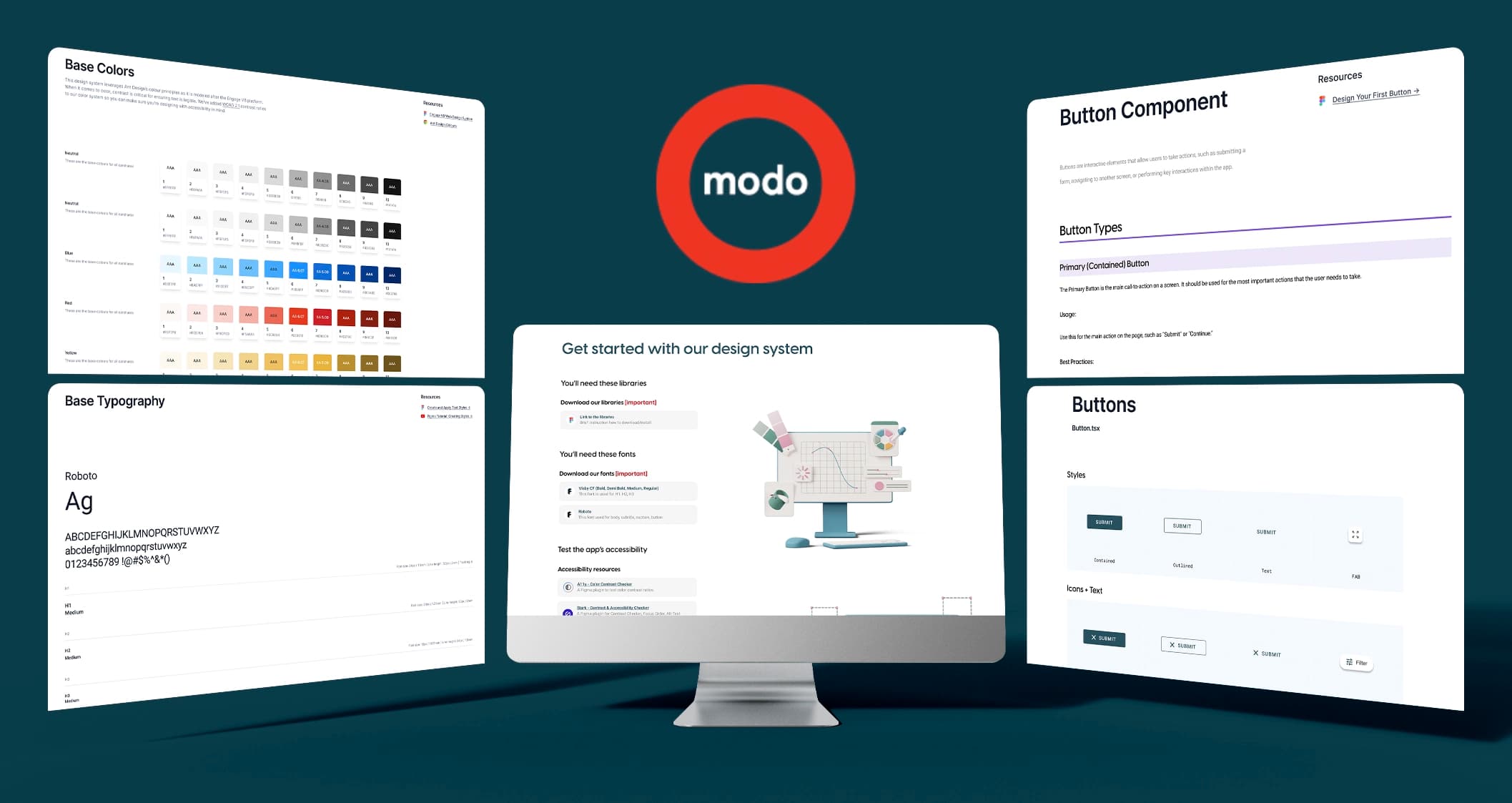
Create a mobile-first design system from the ground up using reusable components, scalable patterns, and clear documentation.
Impact
Established the foundation for consistent product design, streamlined collaboration with development, and created reusable assets that supported future product growth.
Contributions
Outcomes
Building a scalable design system
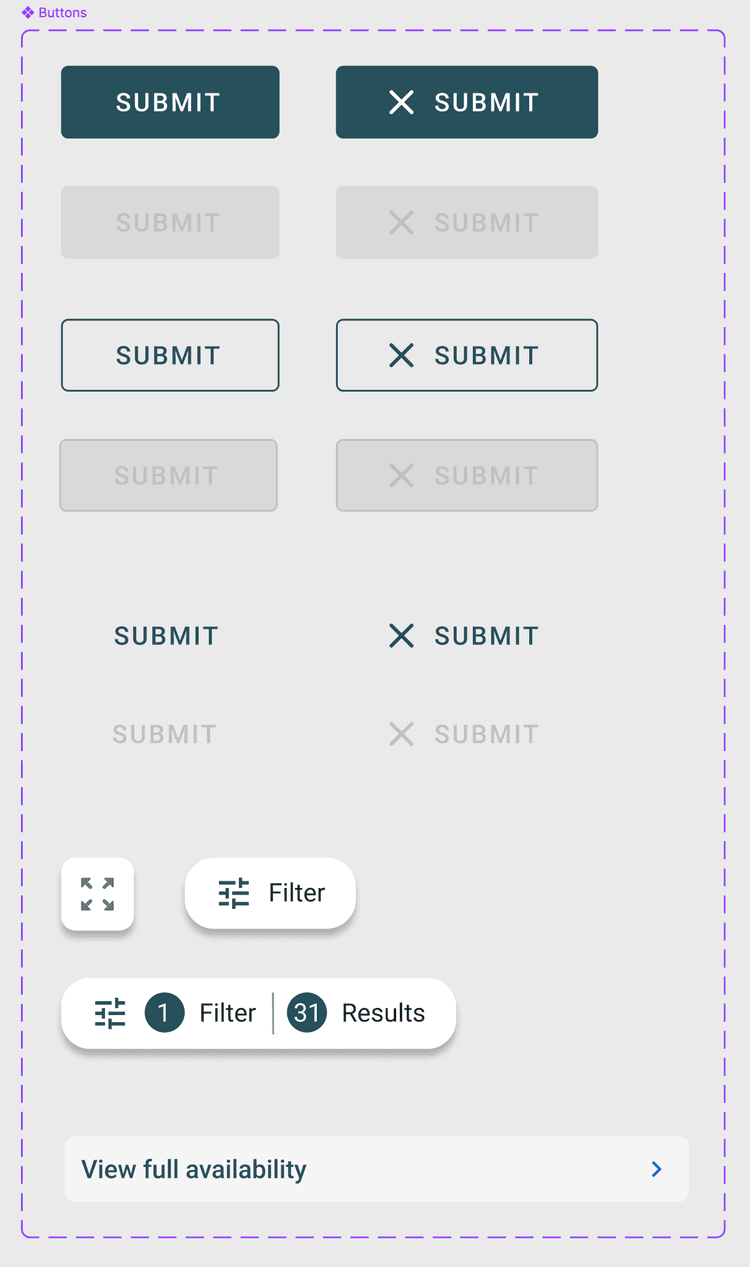
One of the main goals of the project was creating reusable mobile components that could scale efficiently across the product while remaining flexible for future needs.
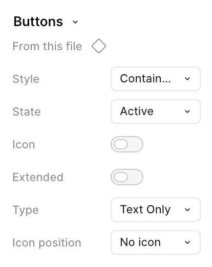
I worked on organizing component structures, defining variants, and improving consistency between design patterns to help streamline the design and development workflow.
Accessibility considerations
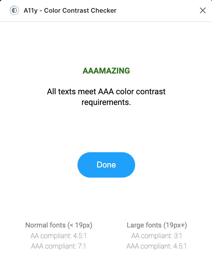
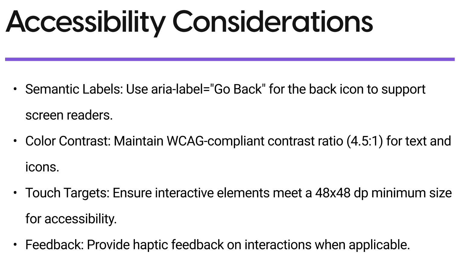
Accessibility was an important part of the design process. Components were designed with readability, contrast, spacing, and usability in mind to support a more inclusive user experience.
The work also involved reviewing UI patterns through a WCAG-conscious lens to help ensure consistency and clarity across the mobile interface.
Flexible component architecture
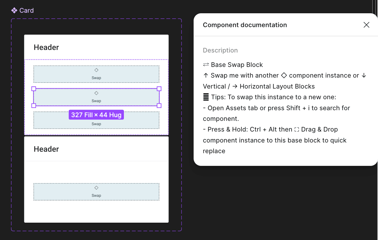
To improve scalability and flexibility within the design system, I worked with a modular swap-block approach that allowed components to adapt to different content structures and use cases.
This approach helped create more reusable and maintainable patterns while reducing the need for duplicate components across the mobile experience.
At the time, this system was implemented before Figma introduced native slots functionality, requiring more intentional component structuring and organization.
Documentation & Collaboration
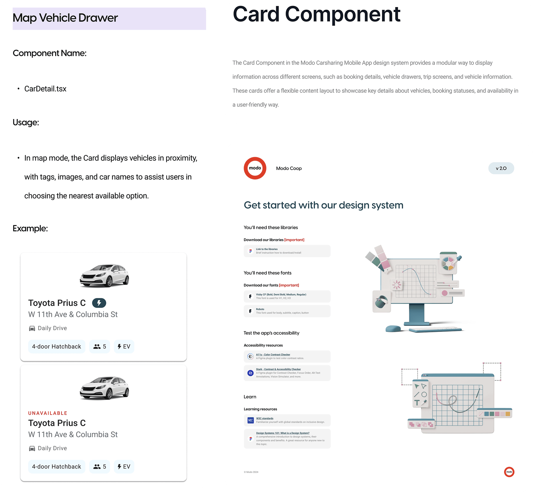
In addition to component design, the project included documenting UI patterns and component behaviours to support collaboration between designers and developers.
The documentation helped improve consistency across the product and made components easier to understand, reuse, and implement.
Reflection
This project strengthened my understanding of design systems, accessibility-focused thinking, and designing within real product constraints.
It also gave me valuable experience collaborating within a professional product environment and building scalable solutions for a real-world mobile platform.